Sunday, April 27, 2014

REMNANTS


Gelliart background, old postage stamps
tree cut out of old book 

To post or not to post....that is the question I asked myself about this page.  Using torn pieces from some of my Gelliarts prints on deli paper, glued them to the page.  There comes a time when you ask yourself....what do I do with all of these remnants of paper...especially when you like them.  The pieces get smaller.  This art is where they landed.  I had a bag of old postage stamps my sister gave me at Christmas (we exchange interesting things!) and so I added some of them as well.  The tree was something I've used as a stencil and rather then put it away somewhere where I probably wouldn't find it again...you know how that goes...I just glued it right on top.  I wrote inside the tree.."There is no rhyme or reason for these pages, they just exist.  Joy in Creation.
The opposite page...

The right side has more of the Gelliart, more stamps from Bermuda and Ceylon and a movie theater ticket from The Best Exotic Marigold Hotel...which takes place in India.  That is a great movie so after I finished these pages, I took out my dvd and watched it....for the 3rd or 4th time!

Inspiration from a box of Tick Control!


The Documented Life Project
Using a box as inspiration
3-Page Spread
Using a prompt from Roben-Marie Smith's Documented Life project....this is what I came up with.  I didn't have a food box hanging around for the inspiration, but I did have this box of flea & tick medicine for my dog, Boomer. So the left page became a place to record his vet appointments.

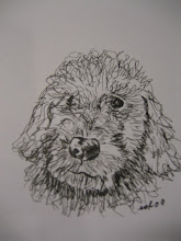
This is the opposite page....since the product is called Spot On...I painted the spots for the background.  The ink sketch I did 4 years ago when he was a pup.

The center page takes its cue from the product brand, ZODIAC...Boomer is a
Sagittarius!  That's his cute  photo you see (I might need a new ink cartridge as he looks slightly lavender here)...oh well!  And I didn't do much with the box itself...but it definitely gave me the cues for the art.

THE DEER CAN'T EAT THESE FLOWERS


The Documented Life Project
Mixed Media

I don't generally have time during the week to work in my art journals.  I shouldn't call it "work"...it's my outlet.  At any rate, I did find the time and the beginning of this page started with a piece of a remnant page I had from a Gelliart print that I happened to like and have used elsewhere.  Then I found the little pen & ink picture of a Country House (I love the cottage look) so that was the next addition to the page...then came the flowers, the circles and pen work to complete the page.  I especially like how the colors worked out.  
On the opposite page, I stitched a piece of paper that I received from Frances Pickering when I ordered her book, Page After Page, about 3 years ago.  

The book is wonderful, has beautiful,  colorful illustrations....amazing.  You can see the stitch marks that she sewed on this piece of paper...which is why I added similar marks to the art I did on the opposite page.  I used my sewing machine to attach her piece to my page.   When you lift that page, it looks like this underneath....


So, my thanks to Frances Pickering for inspiring my art on these pages.  
(I ordered her book from the UK...)

Sunday, April 20, 2014

The Documented Life Project - Front Door

Moleskin Journal
I have had great fun working on this journal today.  The 1st "prompt" we were given is to incorporate our front door into the art.  I had a photo of my front door which I collaged on the right side.  The left page house shape is a piece of recycled art from a project I did a couple of years ago. 


Center Page
When you open the right flap, this is the art in the center of the spread.  The eggs are a photo I took a couple of years ago of some eggs I had dyed. 

 Three Page Spread


The Left Page Above

The Right Hand Page

These pages have acrylic paints, stencils, rubber stamps, collage elements, recycled art, pen, photographs...when I finished, my desk top was a complete mess!  


Thursday, April 17, 2014

The Documented Life - Moleskin Journal

 
Front Cover
Paint, Pens, Collage, Stencil
 
This is the front cover of a new project....altering a moleskin journal.  I saw this on Roben-Marie Smith's website and it looked like a lot of fun.  I'm 4 months late joining this online project and the journal we were to use was a daily planner.  I bought a moleskin with plain pages because I couldn't go back and do a calendar year.  This will actually work better for me.  I've just completed the front and back cover.  Underneath this colorful cover is the basic, black cover.  In order for the cover to accept what I was going to do to it... you have to completely gesso the surface.  Gotta love gesso...the miracle art supply!
 (the black stripe is the elastic that keeps the book closed)
The back cover:
 
 
I have had the shoe for awhile....just waiting for the right place to put it and I like it here.  I love all kinds of music so that is my little "music" contribution to this cover.   So what does all of this mean....these circles and swirls and dots and colors?  For me, personally, they express an inner energy that is me that comes out when I take my art supplies to create.  It's my positive energy.  Can't speak for others but this is what it's about for me.  I can't wait to get inside the journal.  The Documented Life has some great "prompts" for the pages.  


Monday, April 7, 2014

Paint & Wine Class - Matisse!


The Purple Robe
 
I was so excited to see that the subject of our monthly Paint & Wine class was Matisse.  I love the energy, the colors, the patterns, the whimsical aspect of his work.  I love his perfect imperfection if you will.  The perspective doesn't have to be precise.  I think his art is fun.  I would have loved to watch him paint!  

Saturday, April 5, 2014

FEELING COLORFUL

 
EXERCISE IN CREATIVITY
Art Journal - Mixed Media
 
 
I've been an adult for a very long time now, so I don't know why it is that I struggle...with giving myself permission to "play".  This page is all about playing.  I didn't have a theme in mind...I just wanted to have fun with my art supplies and, hopefully, the end result would be good to look at.  I used stencils and spray paints and collage papers and magazine cut-outs and pens and rubber stamps.  Lots of color.  It's not a page that you look at and say ...."that blank is out of perspective or the face isn't quite right"....we're always our own worse critic.  This is an exercise in creativity and it brings me...JOY.  Hope you enJOY.