Saturday, April 30, 2016

It's All About the Hat


It's All About The Hat
 Inspired by Gloria Vanderbilt
Watercolors and watercolor crayons
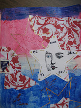
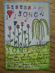
I watched the wonderful documentary on CNN last night, " Nothing Left Unsaid" which was co-authored by Anderson Cooper and his mother, Gloria Vanderbilt.  It was so well done.  One of the things they featured in their story, was Gloria's art.  Well, I knew she was an artist and overall creative person, but I never really looked that closely at what she's done.  I just never paid that much attention...until now.  For someone who has had a very complicated (and interesting) life, her art is very light and whimsical.  I loved it.  So the picture I did above was done on a piece of scrap watercolor paper that I had been using to wipe my brush when I kept changing colors.  Today, I added more colors until I had filled the paper.  I kept turning it this way and that, trying to decide what to do with it...could I make it into something...and all of the colors made me think of a garden party a woman back in Gloria's mother's day might have gone to and worn a big, flowery hat with lots of spring colors.  
A closer look....
I pulled the face out of the background.  She was there.  She's not smiling...more pensive.  Life isn't a garden party after all....

Friday, April 29, 2016

Goats in the Garden

Art Journal
Mixed Media
I couldn't think of what else to call this, but Goats in the Garden.  Originally, I was going to do cows.  I used various papers... some are painted deli paper (for the background); the goat body on the left is from a magazine and the one on the right is just a special little piece of paper I had.  The goat on the left looks like it just consumed the veggies in the garden and the other goat looks dressed up for ...what?
You may not see the connection, but I was inspired to do the page above after doing this page yesterday...
This page is also mixed media, focusing on the color orange.  The orange block on the bottom left with the white blossoms made me think of a cows body which is why I segued to the art posted at the top with two goats.  Makes perfect sense!  Not.  I was experimenting with the body of an animal not having it look like a traditional body.  My art lesson to me today.   Think like a kid.  Think outside the box. Or goat body.  

Monday, April 18, 2016

By The Light of the Silvery Moon


Art Journal
Watercolors, pen, rubber stamp, stencil

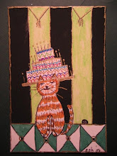
This page in my journal had some "leftover" stuff on it,  i.e., some paint that was leftover on a couple of stencils that I just "smudged" there; some textured gesso.  I kept going back to this page to try and figure out if there was something there that I could pull out of the page.  I'm sorry I didn't take a photo before I started so you could see what I'm talking about.  I kept looking at the black diamond stencil smudge and ultimately decided that was going to be a floor....a dance floor.  My art today was going to be something about Havana....and this is where I ended up...not Havana....although it could be....you just have to listen hard and see if you hear that great Latin rhythm!  


Saturday, April 16, 2016

Aaaachooo!!!!!


Mini Journal
A Cure for the Common Cold

This morning I did these pages in the mini journal....you can see what's on my mind!  My gosh darn cold is driving me crazy.  I used the Waterlogue app on my iPhone to capture the box of Kleenex.  I debated sketching it, but the app is so cool...

I cropped it to fit


and added some text re the word sneeze. 
Easy peasy and you know where I'm at today!

Thursday, April 14, 2016

MINI JOURNAL

Mini Art Journal
2-1/2 x 3-1/2 
Another Bright Idea
Smaller version of Composition notebook
I posted about yesterday
Okay...I never thought I would enjoy working in a journal this small or one with ruled paper!  Guess what?  I am having more fun with this journal.  I did several pages in it today as well as the front and the back cover.
The front cover has a Gelli-art deli paper print as the background.  The title of the book I cut out of my ever favorite source of collage stuff...the Pottery Barn catalog.  I also included a photo I had of a window in my art room.  And the words Art Gallery are also from the Pottery Barn.  Here is some of the inside...
Gelli-art printed on sheet music
with rubber stamp and bird stamp
Under the Yum Yum Tree

The Red Shoes

The Back Inside Cover
Envelope pocket
Diane and Kathy's business card inside
Feather stencil

So these are just a few of the pages I have done in the mini journal. The wonderful thing about a mini journal...I feel like I'm accomplishing something.  Another perk...I love the way it feels in my hand.  Paper lovers know what I'm talking about.  


Wednesday, April 13, 2016

TOOK A CLASS....!


Art Journal
Using a College Ruled Composition Book

This morning I took advantage of an art journal class in a neighboring town's library.  Love that I can do these things now that I'm retired!  As it turns out,  Kathy and Diane, the class organizers, both live within walking distance of my house. They brought all of the fun stuff to create...and when you're doing art journaling, that can be a lot. Above is what I came up with.  I tore images out of magazines, used a paper doily, some tissue paper and a bit of text... the hand was a nice find since I'm left handed!  This page is really in my "wheelhouse" so to speak,  because I love reds, blues and yellows.  

"On life's journey, attitude is everything." 


Part of the fun of doing a class like this, is the creative energy you take home with you.  For the class, we also received a mini version of the composition book and I have already done about 10 pages in that.  (I haven't taken photos of that).   It's so much fun!  Maybe a small book like that is less intimidating....you see results fast and the ideas just keep on coming.  Great class, great fun....great day.

Tuesday, April 12, 2016

Altered Book Journal


Altered Book
I decided to get another journal going and haven't worked in a regular book in awhile.  I'm altering a book that is titled, Roads of the Heart, by Christopher Tilghman.  I picked it up at our annual book fair last summer.  It's smaller than what I've been working in.  Loved the titled...perhaps that's why I bought it.  I only hope that the binding holds up....it looks like it's stitched, but hmmm....not sure.  I started with the right hand page.  The author has a quote there..."All the true fragments are here."  That became my inspiration for the page.  I took a magazine photo of a woman's face and did an image transfer on watercolor paper and glued it in.  It looks like fragments....I also used my metallic watercolor pencils and some water soluble crayons for the background.  A close-up of her face...


I used some gelli prints on deli paper opposite her.  I added the word embark.


A simple couple of pages.  No theme here, I'll just go with the flow


My Homage to David Beck


Art Journal
Mixed Media
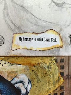
My Homage to David Beck
My previous post told you how inspired I was about the documentary of artist extraordinaire, David Beck.  Yesterday, I did the pencil sketch of him and I printed a copy of it.  I was going to go over it in ink, but I decided to stick with it the way it was.  He loves dodo birds, so I included one on the page.
On the right-hand page, I printed a doorway I found on Pinterest and cut it down the middle so that the doors would open.
When you open the doors, you see two pieces of his work.  The whimsical fish and a larger piece that is exquisite with many doors and places that open.  He is a master of this and I included rubber stamps of keys, keyholes.  And that's a photo of him in his studio on the left.  Below is a close-up of the left-side page.  He is also a musician...thus the musical notes here and there.


This was one of those mornings where inspiration took me by storm.  My favorite kind of journaling.  I wish it happened every time!


Keep an eye out for his documentary....it will be on PBS in the fall.  Thank you, David Beck....

Monday, April 11, 2016

Creative Genius, David Beck


Documentary Film is a must see
We have a terrific library in the town where I live, and yesterday I went to see a documentary film about the artist, David Beck.  His creative genius blew me away.  I really can't stop thinking about it because he is one of a kind.  There is no one who does what he does on the planet.  There's not even a book on him to buy and yet his work is in the Smithsonian.  He is a workaholic artist.  If you have a chance to see this film...you have to go.  I understand it will be on PBS in the fall and I look forward to that.  
So meanwhile, today, I was attempting to draw a pencil sketch of him because I want to capture the feeling of what I saw yesterday in my journal.  It's a beginning...
and here is the photo...
My face is a bit too long and I'm having trouble with the right side.  OK, it needs work. Don't know whether to just go with it, or start a new sketch.  What I'm most interested in capturing, is that tiny little bit of a smile.  He's looking down, so you can't see his eyes hardly at all, but I can see in this photo of him....that sense of humor coming out in his face...which is evident in his art. He is truly gifted.  I don't quite have the vision of the journal pages yet, but I did think that including a sketch of him should be part of it.


Thursday, April 7, 2016

Rainy Day Art


Art Journal
No theme today
Just an art exercise
I'm calling this Rainy Day art because I don't have a theme or anything in particular that's calling me today.  I had my inks, stencils, Gelliarts plate, etc., etc., out.  I can't decide if it's harder to have a theme or not!  If I have a theme, I know what I'm working towards and often times when that's the case, I have an adrenaline rush such as the day I did my Brussels page.  When I don't have a theme in mind...it feels a little more challenging because....what's it going to look like in the end?  How much should I keep adding or did I put too much on and now what?  You know....?  This page has about everything but the kitchen sink if you know what I mean.  It has no meaning, it just is.  Maybe I should call it... IS?
Some more photos....
In the beginning...above and


 one more...

Art IS.

Monday, April 4, 2016

School Bus Yellow?


Art Journal
Acrylics, Collage, Ink, etc.
I'm going to start right off and say that I don't like the floral page.  It's been through a metamorphosis which I will now show you.  And that school bus yellow background???  A bit much but couldn't change it once I went down that road....this was the beginning...
and then...
I didn't know where I was going or what to do with it.  I'd add color and then cover it up and add....
What to do...we are all faced with these moments...

And this is where I ended up.  It's a "still life" for sure.  Too still!

The photo above is a Gelli-art print on deli paper.  My sister created it and I like the colors and the metallic. What you can't appreciate from the photo is the transparency of the print.    I added the oriental symbols and glued deli paper over them.  The card is from Rae Missigman and underneath it I added a quote from Pinterest...I liked the quote and the art behind it.


It's a cool Gelli-art print and I could have saved it to incorporate into a page, but I liked it enough on it's own so it found a home here today.  That's it for today.  School Bus yellow...yikes!

Saturday, April 2, 2016

MY VISION.....


Art Journal
Acrylics, Collage materials
My Vision...allow me to create my art in a space
that is inspired by my one-of-a-kind views

This 2-page spread in my journal was started early in 2015 and not completed.  It's been bugging me that I hadn't finished it.  It's a painting of my art room....except that my art room has changed since I did this.  I have a different art table that now faces looking out the window; and I had left an empty frame above the desk on the right,  where I now have a magazine photo glued to a piece of water color paper.  Once I did that, I realized that I was going to change this spread up considerably.  Having my latest Pottery Barn catalog at hand, I decided to see how many things I might find to cut out and embellish the pages.  The PB catalog never disappoints.  And, honest to God, if you don't know much about color....you could learn from the people that put this catalog together.  Study the colors they combine on any given page....and then plan your journal page(s).  
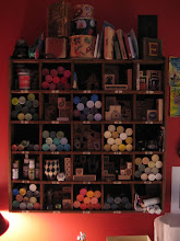
I cut out the gallons of Sherwin Williams paints and added them here and there.  Then I saw the books....had to have some of those, as well as a comfy pillow on my chair.  My art supplies are hugely important so thus the significance of the LARGE turntable of supplies on the table in the middle.  And I couldn't forget to add a couple of the brightly colored plates for summer; and a nice basket to collect some of my "stuff".  The hanging cabinet on the left is actually one I bought from the PB catalog several years ago.  I have two of them...one holds lots of those acrylic paint containers, and the other, not in this photo, holds many, but not all of my rubber stamps.  (The actual cabinet has 25 cubicles).  
Here are the individual page images...

My room is actually painted chili pepper red (Benjamin Moore).  I have to give credit where credit is due!


I have been in this mode lately, where I feel the need to find a home for the things I cut out of magazines....thus the photo above the desk of Private Spaces.  It features a wonderful collection of inspirational odds and ends for the designer who put it together.  It's a "feel good" space.  I totally get it.  There was a time when I wouldn't have thought to cover what I had  already painted with a picture...but I realize that in art, anything goes...let it take you where it wants.
So I think I'm done with these pages.  Happy creating.