Art Journal
Acrylics, Collage materials
My Vision...allow me to create my art in a space
that is inspired by my one-of-a-kind views
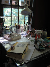
This 2-page spread in my journal was started early in 2015 and not completed. It's been bugging me that I hadn't finished it. It's a painting of my art room....except that my art room has changed since I did this. I have a different art table that now faces looking out the window; and I had left an empty frame above the desk on the right, where I now have a magazine photo glued to a piece of water color paper. Once I did that, I realized that I was going to change this spread up considerably. Having my latest Pottery Barn catalog at hand, I decided to see how many things I might find to cut out and embellish the pages. The PB catalog never disappoints. And, honest to God, if you don't know much about color....you could learn from the people that put this catalog together. Study the colors they combine on any given page....and then plan your journal page(s).
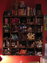
I cut out the gallons of Sherwin Williams paints and added them here and there. Then I saw the books....had to have some of those, as well as a comfy pillow on my chair. My art supplies are hugely important so thus the significance of the LARGE turntable of supplies on the table in the middle. And I couldn't forget to add a couple of the brightly colored plates for summer; and a nice basket to collect some of my "stuff". The hanging cabinet on the left is actually one I bought from the PB catalog several years ago. I have two of them...one holds lots of those acrylic paint containers, and the other, not in this photo, holds many, but not all of my rubber stamps. (The actual cabinet has 25 cubicles).
Here are the individual page images...
My room is actually painted chili pepper red (Benjamin Moore). I have to give credit where credit is due!
I have been in this mode lately, where I feel the need to find a home for the things I cut out of magazines....thus the photo above the desk of Private Spaces. It features a wonderful collection of inspirational odds and ends for the designer who put it together. It's a "feel good" space. I totally get it. There was a time when I wouldn't have thought to cover what I had already painted with a picture...but I realize that in art, anything goes...let it take you where it wants.
So I think I'm done with these pages. Happy creating.























No comments:
Post a Comment