Art Journal
Water soluble crayons, water colors, pen
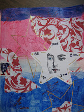
I'm not inspired by any particular "thing" today, not feeling the frenzy of a thought that I have to get in my journal. So I pulled out a couple of pages I tore out of a Pottery Barn catalog as well as House Beautiful to play with color. I only went with colors from the left photo for this exercise.
I started with my crayons and put down shapes on the page
Looks like my kindergarten self coming to life. I say to myself, there's no pressure here because I'm not trying to replicate a face or animal, etc. (Seriously, I'm always thinking about how something is going to turn out, but I shouldn't...this is a journal)....play!
Once I start moving the crayon around with water, the colors to me become luscious. At this point, I also added some water colors to the background. I suppose I could have ended it here. But as you see in the top photo, I started using my black pen and my Bic white pen.
I will say that doing this exercise....is meditative. It's quiet time. I think a lot as I'm going through the motions. I might not be done with this page.....I see more opportunity for adding color. I knew a woman once who was a rug hooker and she was quite good at hooking and even dyed some of her own wool. Unfortunately, she didn't have a really great sense of color. I would look at her work and think about how much time it took to create it...but only if the color choices were just a bit better. The important thing though...it was her work and she got such pleasure from it. What we see in magazines and catalogs is not random...a lot of thought goes into the colors that have been chosen. I know I can learn (continue to learn) a lot from studying them.



















No comments:
Post a Comment