Monday, July 28, 2014

A Heavenly Post.....

ART JOURNAL
Acrylics, Collage

What is Heaven on Earth for You???
Inspired by a great sermon at church on Sunday...I created these pages.  What IS Heaven on earth for you?  My first thought was a symphony!  Think of all of the components that make up a symphony that together....make heavenly music.  
I love all kinds of music and old movies....and the top song from 1935 (before I was born, thank you) was "Heaven I'm in Heaven" from the movie Top Hat.  Fred Astaire and Ginger Rogers danced "cheek to cheek."  


I added this flap that has the lyrics to the song.

Here is the centerfold photo of Fred & Ginger.  I added a piece of embossed white paper for her skirt and I painted that pant leg for Fred.

The inside of the flap says, 
"What is Heaven on Earth for you?"
Fun to think about and so many possibilities.


Friday, July 25, 2014

EXPLORING ART

ART JOURNAL
ACRYLICS - GELLI ART

"Imagination is everything. 
 It is the preview of life's coming attractions."
----Albert Einstein

I've been exploring different ideas lately.  I went to a local art supply store this afternoon and bought a canvas.  I want to do a larger painting so with that in mind, I started adding paint to my journal page.  I'm leaning towards a landscape of some sort and by experimenting here first, I hope to figure out what's going to go on the canvas.  I always end up with something that is more folk art in style and I have to say that I like the way this turned out.  It's primarily acrylics except for the tops of the trees and the tree trunks which are Gelli art prints I recently printed.  I like the way the colors look on the treetops.  I had absolutely no plan when I started this page except that I knew trees were going to be somewhere on the page.  I'm not sure I can pre-plan whats going on the canvas because there is a certain serendipity to art that makes it unique but I have to decide overall what colors I want to use and that will dictate somewhat the direction of the piece.  Will it be a daytime landscape or a night time landscape (I always love stars)!  What season?  Total fantasy or some realism.  So many thoughts flying through my head!  It will be colorful, that I do know!  TGIF!!

Saturday, July 19, 2014

HEXAGONS OF COLOR


ART JOURNAL
INSPIRED BY CARPET HEXAGONS
from Kinderground found in
House Beautiful

These were apparently originally designed as 3' carpets for children's rooms.  I collaged them to these pages.  I added the black, blue & red paint around the shapes as well as the checkerboard border for some more punch.  You could embellish them more, but I didn't want to take away from the carpets that attracted me in the first place.  I added a tag that says Source of Inspiration, House Beautiful and on the back of the tag is info on the carpets.  I decided that since this journal is going to be about shapes and color and techniques, that I should have information on the original source of the inspiration.  I saved a small piece from one of the carpets and added it to the tag.


DO WHAT PLEASES YOU!

ART JOURNAL
Collage circles using Gelli Art prints
Rubber stamp vine pattern
Pens and Washi tape & Acrylic paints


CLOSE UP
I've come to the conclusion that some of my art journals are intended to have some kind of message incorporated into the pages and actual drawings of people and places and things.  After doing these two pages which are not any of those...just playing with shape and color....I decided to start another journal that is nothing but playing with shape and color and trying out different art supplies and techniques.  So....this is what I started this morning...


Strathmore Watercolor Journal
Gelli Art print on deli paper for background;
Water soluble crayons around the borders;
$15 Sherwin-Williams paint coupon provided
the words Paint Palettes and the paint cans.

I often find great inspiration in home design magazines...for shapes and colors and patterns and the Pottery Barn catalog!  Can't forget that!  I have all of these blank journals....I might as well use them.

 I have a tendency to over think my art.  When I look at some artists work...their style is consistent, always recognizable as theirs. I know I've commented on this before.  I don't see that necessarily in mine...so does that mean I'm still trying to figure out my style or don't I have one that I can say is unique to me?  Who am I?  Perhaps it all boils down to doing what makes you happy.... :)  Less thinking....more ART!


Sunday, July 13, 2014

REFLECTION

Rhododendron

It's a quiet Sunday morning. The sun hasn't come through the clouds yet.   I've been wandering in and out of blogs and looking back through my own.  I chose this photo that I took earlier in the spring as I thought it was a good one for this particular post....The flower shows you how perfectly nature was thought out in Creation.  
That brings me to what is it exactly that I want my art to say?  And what do I want my art to be?  I do love working in art journal format  but I don't want it to become a scrapbook.  I find art journaling to be a very meditative activity.  It is also fun....not to leave that out.  Sometimes, I can't get the inspiration in my head down on paper fast enough....and if I don't, it often leaves me and I move on to something else.  I hate when that happens. 

Don't you ask yourself why you're here? 

 I do feel that art is a way of making my mark on the page..my life...this is who I am and why I was here and I hope you like what I have to say or, perhaps, understand a little better who I am and things I care about. I don't use many words in my art journals; I hope the art tells you the story. On the other hand, what I've painted may have particular meaning to me....but to the viewer, it's just a painting. 
  
 I don't want my art to be "kitschy".  Surfing blogs of artists can be intimidating.  Do I use "time" as an excuse for not committing to doing work outside a journal...a canvas or larger painting on paper?  I'm always saying I don't have enough time....If I devoted more time...would my work be better, would I work more slowly and carefully.  I don't know.  I think it's more about...would the art on the canvas be good enough...that's always been my struggle on many levels...being good enough. 

  We are a society that moves so fast that we don't often stop and think...and then it's too late.  That's my Sunday morning reflection.

Saturday, July 12, 2014

For The Love of Sisters

ART JOURNAL
Acrylics, collage, gelli art print, washi tape, water soluble crayons
The inspiration for these pages started with a "coupon" I received in a Valentine card from my younger sister, Kahlie (Karen).  We live on opposite ends of this country and haven't seen much of each other over the past 20+ years.  So, in 2013 she gave me this "morning stroll" coupon with no expiration date...a cute idea, and I've saved it.  You'd think I'd do a Valentine's Day spread using it, but floating around my art room, I was afraid I would lose it.  
The coupon was quite colorful, so I just grabbed color from it to do my doodling around it with paints and a black pen.
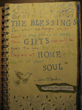
This might be my favorite part of the spread.  It has quite a bit of texture.  The background is a gelli print in pale pink and white and green.  Then I took a floral napkin and cut out three of the flowers and glued them to the page.  The piece of paper scrap with the whirls of color down the left side is a piece that I love and almost have none left, but it found a home here, also up in the right side corner.  Last but not least, the page needed a quote.  I am one of 3 sisters and I have 3 flowers on this page, which says "Sisters are different flowers from the same garden."
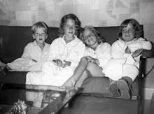
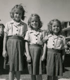
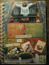
When you flip open the right-hand page, here is more about sisters including a photo of us from 1968...it's faded a bit.  Make A Wish is from artist Mary Engelbreit.
Does this close-up help?  My sister, Dianne, on the left, had some blond locks then so it's a little harder to see her in the light color....I'm in the middle and Kahlie, the coupon provider, on the right.
Three-page spread open

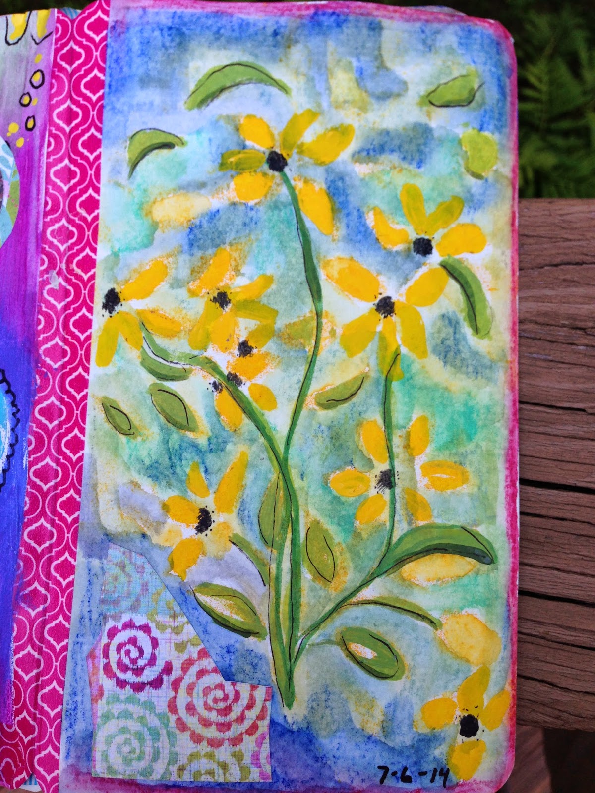
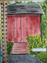
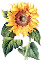
I don't usually post so many photos for one subject, but there was a lot going on here.  I love the black-eyed susans....flower for the state of MD where we grew up....

Sunday, July 6, 2014

THE BEACH BOY


ART JOURNAL
Acrylics, collage, photo
When I posted the right-hand page, I didn't have an idea yet for the left side.  Combing through some photographs, I came across this photo of Tom at Bethany Beach.  I'm prejudice, but isn't he just the cutest little beach boy ever??!!!!   Now the 4th of July art is complete.  Hope you had a good 4th.

Friday, July 4, 2014

4th of July Spirit

ART JOURNAL
Paint and Pen
Dog Under A Table

Having fun with a little bit more red, white and blue.  
Using Boomer as my model.....

HAPPY 4TH OF JULY!

ART JOURNAL
COLLAGE
I love this holiday.  I turned on WMNR this morning and Yankee Doodle Dandy was playing on the radio.  This was a quick page I did in my  art journal.  I can always count on Coastal Living or the Pottery Barn catalogue to have a great photo of our flag and this one practically fills the page.  Then I cut out the word HOME and added it in several places.  What you can't see is that at the very top of the page I had cut out "One of a kind"...I didn't quite get that in the photo!  
And how perfect is this sticker I saved from my recent purchase of American flag stamps!  Have a great day!