Sunday, July 31, 2016

Random Thoughts


Art Journal
Ideas Flourish in the Garden of my Mind
Acrylics, collage, ink, stencil, rubber stamp
These pages are in my small Dylusions art journal.  Sometimes when I sit down to create some art....I have specific ideas in mind...and sometimes, it's like it is this morning.  I started with the ginko leaf stencil and then kept going to see where it would take me.  Close-up...

Ideas do flourish in the garden of my mind....

Yesterday's Art

Acrylics, stencils, collage
These pages in my journal are good exercises.  While I'm not drawing anything specific, I'm playing with colors and shapes and training my eyes...what do I like and what don't I like and what works and what doesn't work.  You have to keep playing.

Tuesday, July 26, 2016

Watermelon Woman

Watermelon Woman
Water colors and Ink
Inspired by photo in
Conde Nast Traveler
I instantly loved this photo of a woman selling her watermelon slices that appeared in Conde Nast Traveler....a great resource for inspiration.  The photo is filled with patterns from the watermelons to the clothing she is wearing.  All of that attracted me to want to capture her.  I exaggerated her hands to indicate that she is a hard working woman....I can't help but wonder what her face might look like.  The photo was from an article on an area of Mekong, in Southeast Asia.  Watermelon anyone?
The sketch


Close Up

Never Been to Brooklyn.....

Never Been to Brooklyn
Sketchbook
Water colors and Micron pen
I don't recall that I've ever been to Brooklyn, however, this rooftop deck was a featured photo in the most recent House Beautiful magazine.  There was something about it....I supposed it could be a rooftop deck in any city, however, it's that steeple that would identify it as being in Brooklyn...if you know Brooklyn.  Here's the photo:
I've certainly taken liberties with the drawing but I almost felt as though I put myself there.  How lovely to have a deck like that in Brooklyn!  If you can't be in certain places to do a sketch, finding a photo in a magazine is a good alternative.  All that deck needs is a pitcher of sangria and some nachos...and some music! 
Last look....

I also did a quick little sketch of a leaf I found in my yard before the torrential rain hit yesterday...it seems a bit early for a red-orange leaf, but there it was.  I looked up and didn't see any more that looked like it.  The part of this sketch that is possibly more important than the leaf, is learning what colors would best support the leaf and make the page more interesting.  I think these colors do the trick.  I'm not ready for the leaves to be changing though!


Thursday, July 21, 2016

A Garden Is A Happy Place


In my journal
Ink and Water soluble color pencils

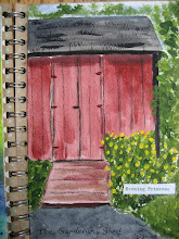
I've managed to spend a lot of time focused on art this week, learning more about how water colors work and having fun drawing in ink.  Of course, I don't have a garden that looks like this...except in my head.  It does reflect how I feel about my current enjoyment of getting things done in my yard...and I hate to keep saying...since I retired...but it's true...I have time for the yard other than mowing!  Last night I did the sketch...


I debated whether I was going to add any color...but it is a garden after all...so I very lightly added color.  This mixed media journal doesn't like too much water, so that's why I used the water soluble color pencils with just suggestions of color.  A little close-up....

It's important to keep the mind in a happy place...this little garden drawing takes me there.  Wouldn't you like to sit on that bench?


It's A Peachy Day

Earlier in the week, I drew and painted the 3 peaches.  They were about to be consumed so felt I better paint them first.  I enjoyed the colors and the process of looking at something "real" and actually making them look like they are peaches. 
The page on the left side, I actually did after the one on the right.  I had recently taken a book out of our library on the artist, Kaffe Fassett, simply titled MOSAICS.  He is an extraordinary artist on many levels and if  you're not familiar with his mosaics....they are unbelievable.  I'm not someone who would do mosaics, but it was incredible eye candy looking at his designs and colors.  I can't begin to imagine the amounts of broken dishes, glass & tile he has accumulated over the years...not to mention organizing it.  And mosaics aren't his only medium.  What the book did for me, is give me inspiration with regards to colors and shapes.  I decided to try and draw a similar page of peaches on the left side page and I actually was going to paint it...but I don't believe I could capture the same effect if I had used color.  So I just called it "Un-ripened Peaches" and left it.  Hopefully, the 3 darker spots you can distinguish as the stems of the peaches.  It was interesting to get in sort of a mosaic mind-set to do the page. (At one point, I had considered painting papers the colors needed for the peaches and background and was going to cut them up into tiny pieces and glue them to the drawing.  The thought of the messy glueing process sort of ended that...)
And that led me to...


The Pear
Ink and water color and collage

This page didn't actually start out as a pear.  It started out with me trying to press a Queen Anne's Lace flower into the green, wet water color.  Failure.  The flower was just to fragile to make the imprint.  Queen Anne's Lace is so geometrically symmetrical....like a snow flake.  Even the underside is interesting...but obviously you don't see it here.  So I came up with Plan B...going back to Kaffe and mosaics.  I drew the pear and painted it like a mosaic.  I was just about finished with the page and was painting a border around the date on the bottom right (which you don't see because I had to cover it) as my hand grazed the page and smeared the black paint.  Now I was in rescue mode.  I tried several things and ultimately was afraid I was going to wear a hole in the paper so I grabbed some patterned paper, cut a couple of leaf shapes that would cover my mistake and glued them to the page.  Phew. 


It's been a fruitful, educational week for me in my art room.


Saturday, July 16, 2016

POOLSIDE SKETCHING

A DAY IN NORTH SALEM
Watercolor Sketchbook

In my 5 x 7 sketchbook this week, I sketched some of the backyard of my friend, Jan's home.  It was a beautiful day.  The red building is the horse barn...perhaps I should have had a horse's head looking over the fence, but I already had a lot going on on this small piece of paper.  And Boomer came with me for the day.  Here he is checking out the pool....couldn't get him to test the waters though....he was very curious about the horses on the other side of the fence!


Friday, July 15, 2016

ART-FUL WEEK


NEW ART JOURNAL
ACRYLICS - COLLAGE
Stencils - Rubber Stamps - Ink

I started a new art journal today....back to a small one ( 5x8 I think).  Taking a new tact with my approach to my art. Instead of sitting in my chair thinking about what I'm going to paint...I went to my art room and got started.  I have to do that if I'm going to see growth in my approach to art. So I put some paint on the background (which I then changed). I glued pieces of newsprint from my local paper this week.  There was an ad for sidewalk sales and a map of the stores participating.  That ended up setting the tone for my pages.  I hadn't intended to do buildings, but that's what I ended up with!  In the close-up below, you can see the map under the "2".  It reminded me of windows.  I'm happy with how it turned out.   Close up..


The next pages....

Inks, Acrylics, Collage

It's a really warm summer day here, so I'm not doing anything in my yard...I decided to start another painting in the journal.  Where it started and where it ended up....whoa!  I started by using my colored inks with their eyedroppers and dripped paint on the page.  I thought I was going to do something edgy and modern.  Well...the inks had a mind of their own and it wasn't working. The black bottom of the pages changed colors 4 times.  Where the large flower is...a large blob of ink dropped from my fountain pen.  So...you just get creative and do what you can to "save the page".  And you learn in the process.  These two pages were more challenging than the art above because of the issues I ran into.  In the end...a fun, colorful painting.  Close up....


Yes....color outside the lines.....

Monday, July 11, 2016

More Red, White & Blue....I can't help it.....


Rockin' July 4th
Collage - Acrylics - Watercolor - Ink
In my art journal
I was gathering the newspapers to recycle for the trash pick-up this week when I remembered that I wanted to save the front page photo from our weekly town newspaper, celebrating July 4.  The photo is super! 
I glued it to the middle of my journal page and added some blue paint around the top and sides. Then I painted a "flag-like" stripe across the bottom portion and added some people to watch the fireworks.  I also added some more drama to the fireworks with acrylic paint in order to make the photo and my art a more cohesive piece. 
It sort of reminds me of my younger years of watching a movie at a drive-in (without the cars). Kind of lovin' this page.  I'm all about the red, white & blue.
Some close-ups...


Love the 4th of July!

Sunday, July 10, 2016

MORE SKETCHING....


I've been doing little sketches in my 5 x 7 sketchbook.  For the first one, it was one of those days where the sky just kept getting darker...and then the heavens opened for some much needed rain. It was so oppressive that day...the air was heavy.  I didn't know how to capture that...but I still like my sketch.
Stormy Weather

The Bethel Cinema
I took some artistic license with this sketch.  I drew it prior to catching a matinee recently while sitting in my car.  I drew the theater and took photos so that I could paint it when I got home.  The tall sign piece on the right, actually is up by the road, to let you know what's in the shopping center.  I thought it added enough interest to include.  If I were to paint this sketch the way the building looked....it would have been entirely beige.  There are really no interesting architectural features to this place, so, at the suggestion of my artsy sister,  I added purple to the glass and orange to the roof and the pops of greenery to give it some kind of color.  If they were to paint the brick façade on this shopping center...it would give it some zip!  That aside...it's my favorite theater to go to as they show great films.  And the last sketch I did today....

It's The Berries
I have a mini red colander that I put my blueberries in.  So...prior to eating them...sketch!  The berries outside the colander show today's date.  And I splattered it with some of the blue paint...blueberries can be messy!


Sunday, July 3, 2016

Making Me Crazy!

Updated
This painting of Gloria Vanderbilt has made me crazy!  I've made some slight changes...changed her jaw slightly, her nose is better and I worked on her teeth.  Still not quite Gloria, but improved, I think.

More sketching I've done this weekend:

BOOMER!


My Garden Blooms