In my journal
Ink and Water soluble color pencils
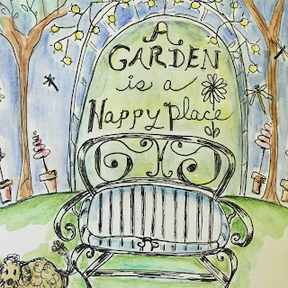
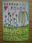
I've managed to spend a lot of time focused on art this week, learning more about how water colors work and having fun drawing in ink. Of course, I don't have a garden that looks like this...except in my head. It does reflect how I feel about my current enjoyment of getting things done in my yard...and I hate to keep saying...since I retired...but it's true...I have time for the yard other than mowing! Last night I did the sketch...
I debated whether I was going to add any color...but it is a garden after all...so I very lightly added color. This mixed media journal doesn't like too much water, so that's why I used the water soluble color pencils with just suggestions of color. A little close-up....
It's important to keep the mind in a happy place...this little garden drawing takes me there. Wouldn't you like to sit on that bench?
It's A Peachy Day
Earlier in the week, I drew and painted the 3 peaches. They were about to be consumed so felt I better paint them first. I enjoyed the colors and the process of looking at something "real" and actually making them look like they are peaches.
The page on the left side, I actually did after the one on the right. I had recently taken a book out of our library on the artist, Kaffe Fassett, simply titled MOSAICS. He is an extraordinary artist on many levels and if you're not familiar with his mosaics....they are unbelievable. I'm not someone who would do mosaics, but it was incredible eye candy looking at his designs and colors. I can't begin to imagine the amounts of broken dishes, glass & tile he has accumulated over the years...not to mention organizing it. And mosaics aren't his only medium. What the book did for me, is give me inspiration with regards to colors and shapes. I decided to try and draw a similar page of peaches on the left side page and I actually was going to paint it...but I don't believe I could capture the same effect if I had used color. So I just called it "Un-ripened Peaches" and left it. Hopefully, the 3 darker spots you can distinguish as the stems of the peaches. It was interesting to get in sort of a mosaic mind-set to do the page. (At one point, I had considered painting papers the colors needed for the peaches and background and was going to cut them up into tiny pieces and glue them to the drawing. The thought of the messy glueing process sort of ended that...)
And that led me to...
The Pear
Ink and water color and collage
This page didn't actually start out as a pear. It started out with me trying to press a Queen Anne's Lace flower into the green, wet water color. Failure. The flower was just to fragile to make the imprint. Queen Anne's Lace is so geometrically symmetrical....like a snow flake. Even the underside is interesting...but obviously you don't see it here. So I came up with Plan B...going back to Kaffe and mosaics. I drew the pear and painted it like a mosaic. I was just about finished with the page and was painting a border around the date on the bottom right (which you don't see because I had to cover it) as my hand grazed the page and smeared the black paint. Now I was in rescue mode. I tried several things and ultimately was afraid I was going to wear a hole in the paper so I grabbed some patterned paper, cut a couple of leaf shapes that would cover my mistake and glued them to the page. Phew.
It's been a fruitful, educational week for me in my art room.























No comments:
Post a Comment