Wednesday, March 30, 2016

MANIFESTO FOR INTROVERTS


Art Journal
Watercolors and Pen
Rubber Stamps
So this BUG is an introvert??  Well, he is for my journaling purposes here.  He certainly doesn't look like an introvert.  It's not always easy to tell an introvert.
I found this piece of paper that I had displayed at my work desk before recently retiring...I think it's big enough to read....because, well, I am an introvert!
Maybe that's why I enjoy creating art so much....an easier way for me to communicate what I'm feeling and thinking.


On the page where I put the manifesto, underneath it I glued pieces of napkins.  These napkins were in my fun retirement basket and the circles says things like... Follow Your Dreams, Listen To Your Heart, Be Fearless, Make A Difference.  Even in retirement...there's time to do these things.  

Monday, March 28, 2016

WHAT BRINGS YOU JOY?


Art Journal
Pottery Barn Catalog
Water soluble crayons
You don't have to know how to draw to create something that you like.  I'm constantly tearing things out of magazines, catalogs, even shopping bags that inspire me.  I love the color and patterns of these melamine plates that have appeared in the Pottery Barn catalog.  They're totally in my color wheel....the reds, blues & yellows.  And there is something about circles that I'm drawn to (no pun intended).  So I took the page and cut out the advertising around the plates and started to place them on the page.

Once they were glued down, I had to decide what I was going to do with all of the white space....
I took my water soluble crayons...can't say enough good things about them because the colors they provide are so lush....and started to fill in around the plates, overlapping colors as I went....
The fun part comes when you take your paint brush, dip it in water, and start to move the color around.  You do have to rinse your brush as you go from color to color so you don't end up with mud...and I sprayed it with a fixative when I was done to seal it.  Because the crayons are water soluble...that is something you want to do.  This page was just fun to do...and so easy!  So the picture that I love, now has a home in my journal. Perhaps in the future,  I'll re-create this page in water colors, and actually draw the plates.  OR....maybe a large canvas in acrylics!  This is why journals are great....where ideas are collected...

My journal is getting really full now and because of that, it's hard to draw and paint on the left side page.  So I've decided that I will continue to create art on the right side, but leave the left side for random "stuff". 


 I did color the background... I used a stencil, and I drizzled green ink on it and dipped my fingertips in water colors but no drawing. I can't just leave a background white.  And then I glued an article about Kazumi Yoshida..."an exuberant artist is all about positive energy, spontaneity, and bringing joy to your world."  He does that!  EnJOY creating your art!

Sunday, March 27, 2016

Blessings!


Sharing a favorite poem by the late John O'Donohue....

"The Equilibrium, a Blessing:
Like the joy of the sea coming home to shore,
May the relief of laughter rinse through your soul.

As the wind loves to call things to dance,
May your gravity be lightened by grace.

Like the dignity of moonlight restoring the earth,
May your thoughts incline with reverence and respect.

As water takes whatever shape it is in,
So free may you be about who you become.

As silence smiles on the other side of what's said,
May your sense of irony bring perspective.

As time remains free of all that it frames,
May your mind stay clear of all it names.

May your prayer of listening deepen enough
to hear in the depths the laughter of god."

Saturday, March 26, 2016


Art Journal
Watercolor/Ink
On the eve before Easter Sunday, you might think that this looks like young girls in Easter hats...except they're not.  The inspiration comes from Pagan, Burma...sort of ironic.  The inspiration photo on the left is about young girls dressing up for a special occasion...once upon a time young girls did that!  Nowadays, it seems like anything goes.  I took bits of the photo and created the art.  I do love the photo.  

Tuesday, March 22, 2016

PASSION WEEK - It's A Mad World


It's A Mad Mad World
Acrylics, water colors, ink, collage

Today we awoke to the news that Brussels had been hit by two bombs, one at the airport and one at a train station.   This what I call my art when I do it in a sort of "frenzy".  This just isn't the week for Easter eggs and chicks this year.  To what end is all of this that's happening in the world?  A close-up below of some of the lost souls ....
And I did put words from the song, It's A Mad World, here and there.

"Bright and early for their daily races...going nowhere, going nowhere."
That song was sung on the live TV performance of a modern day Passion which was quite good if you happened to see it.  It is a mad world.

Sunday, March 20, 2016

THE TOWER OF BABEL

ART JOURNAL
The Tower of Babel
Watercolors and Pen
I just love art journaling.  Sometimes the ideas in my head are flying so fast that I can't get the art down in my journal fast enough.  Of course, sometimes I have no ideas at all!  What's been going on in my head is this current political atmosphere we're in (for lack of a better word) and the fact that communication has been a problem since the beginning of time....and it isn't getting any better.  New technology does not necessarily translate to better communication.  That's my opinion.  I pulled out my watercolors (kind of a new medium for me to play with) and did a rough sketch of my vision of the Tower of Babel.  
What I wrote across the top of this page says...
"...a united humanity of the generations following the Great Flood, speaking a single language and migrating from the east...they agreed to build a city and tower; seeing this, God confounded their speech so that they could no longer understand each other and scattered them around the world."  (Book of Genesis myth, Wikipedia).
On opposite journal page

In my mind, these two pages, while totally different artistically, are connected.  At least that is my intention.  
Around her face I wrote, "Really listening to someone is a very tender and precious gift."  (I read that in a Jan Karon novel).  But it's so true. The other
writing on this page that I wrote says, "The world has a problem with communication...."
Here is how the pages look side by side.  The tree of life behind her head I tore from one of my practice journals...well, all of my journals are practice!  The moral of my art today is....we didn't figure it out in ancient times....and we still can't figure it out today.  

Friday, March 11, 2016

REPEATING STENCIL - New Page


Art Journal
Mixed Media
Painted Deli Papers
Twig, seashell, same stencil as previous post


The inspirations for this page were this stamped figure on graph paper, and the bottle in the sand that says "pick me"....torn from a Pottery Barn catalog.  Also, I wanted to try the same stencil I've used on 2 other pages this week, just to see what I could come up with.  When I first laid the stencil on the paper, I decided to paint it in sections from the bottom up.  The bottom was blue, the middle was orange/yellow and the top was yellow.  Then I put down the painted deli paper that the figure is glued to.  I left some of the graph paper because I think it adds visual interest.  I tore some more deli paper for the bottom...the blue pieces and the sea shell under the bottle.  I like adding organic elements like the twig and the seashell....although it's getting harder to close this journal.

More....

I didn't add ink to this page.


Here are the two pages together. I'm not sure it looks like the same person did both of them!  All in a days' creativity.  

IT STARTED WITH A STENCIL


Art Journal
Mixed Media
Acrylics, pen, collage material

I had two inspirations for my journal page this morning.  One was the full page stencil (the same one I used in yesterdays' art) and a floral envelope.  As far as the stencil, I thought it might be a fun exercise to use the stencil on several of my pages as the starting point.   Below you can see the stencil...very pale in color except for the bluish flower because my stencil still had some paint on it!  No matter.  The floral envelope with the postage stamps became a dress.  And on the left side, I have part of a napkin.
The head above is actually a colored egg I cut out of a magazine and painted over.  The shape was perfect, of course.  Now I started adding color.  Looks kind of like a mess so far, but I knew it had potential.


I just kept adding more color...

....and some ink to finish. The envelope was really the focus of this page. Lots of color, lots of fun.

Thursday, March 10, 2016

HAPPY BIRTHDAY, SON!


Art Journal
Mixed Media
Celebrating Tom!
This was a fun "birthday cake" to make.  Tom won't be home to celebrate the day, but we've been together for almost all of his 28 birthdays.  This cake is made of some birthday candle tissue paper which I love because it's so colorful. I also have a strip of thumbnail beach photos from when he was just a little guy to a grown man.  There's a picture of him in Morocco with a surfboard and in the water on the LI Sound holding on to a buoy.  The pale green piece on the top right says he is "kind, deep and talented", from a horoscope I found actually a couple of years ago.  There's a little more of the horoscope in the middle of the page.  Here are more photos of the page....

Below is the two-page spread.  The page on the left includes a large stencil, spray inks, water soluble crayons and ink as well as a quote.


When I finished this art yesterday, I took a drive to Sherwood Island State Park on the LI Sound....a beautiful warm day for this time in March, reflecting on this day, 28 years ago....


Sunday, March 6, 2016

IT'S THE PROCESS!


Strathmore Watercolor Journal
Non-Dominant Hand 
Faber Castell Pens - Ink

I debated whether to post this.  When I'm just practicing stuff, sometimes it doesn't seem worth sharing.  I'm taking a wonderful, on-line class of Pam Garrison's.  I won't go into detail, but this particular exercise is using a pen and your non-dominant hand to just make lines-marks on the page.  I did that.  Then you're supposed to look at the lines-marks and see if you "see" anything....flowers, birds, etc.  and once you decide what you are looking at, you add color to the page to bring these drawings out.  OK.  This is a challenge! 
The drawing itself is random;  you're not supposed to think about anything except making marks on the paper.  And then you study the page. It's harder than you think. Pam makes it look so easy! The page above...I had to ignore some of the lines and see if I could come up with something and it ended up with being a pregnant woman doing a little exercise.  I left her belly white so it would stand out.  I didn't "see" birds or flowers...in fact, I ignored some of my lines in order to come up with a drawing at all.  My problem...and it is my problem...is that I hate the learning process.  I just want to see it done and be able to do it instantaneously.  IT JUST DOESN'T WORK THAT WAY!  Pam's class on Creative Bug is really great.  I just have to bite the bullet and do multiple (yikes!) exercises to get the technique down. 
Below is one of the exercises...I just didn't see anything to pull out of the page.


And here's another one....

It's just random.  So...I'll continue to watch her video and learn the technique...I hope!

Wednesday, March 2, 2016

Junk Mail Journal - Pottery Barn


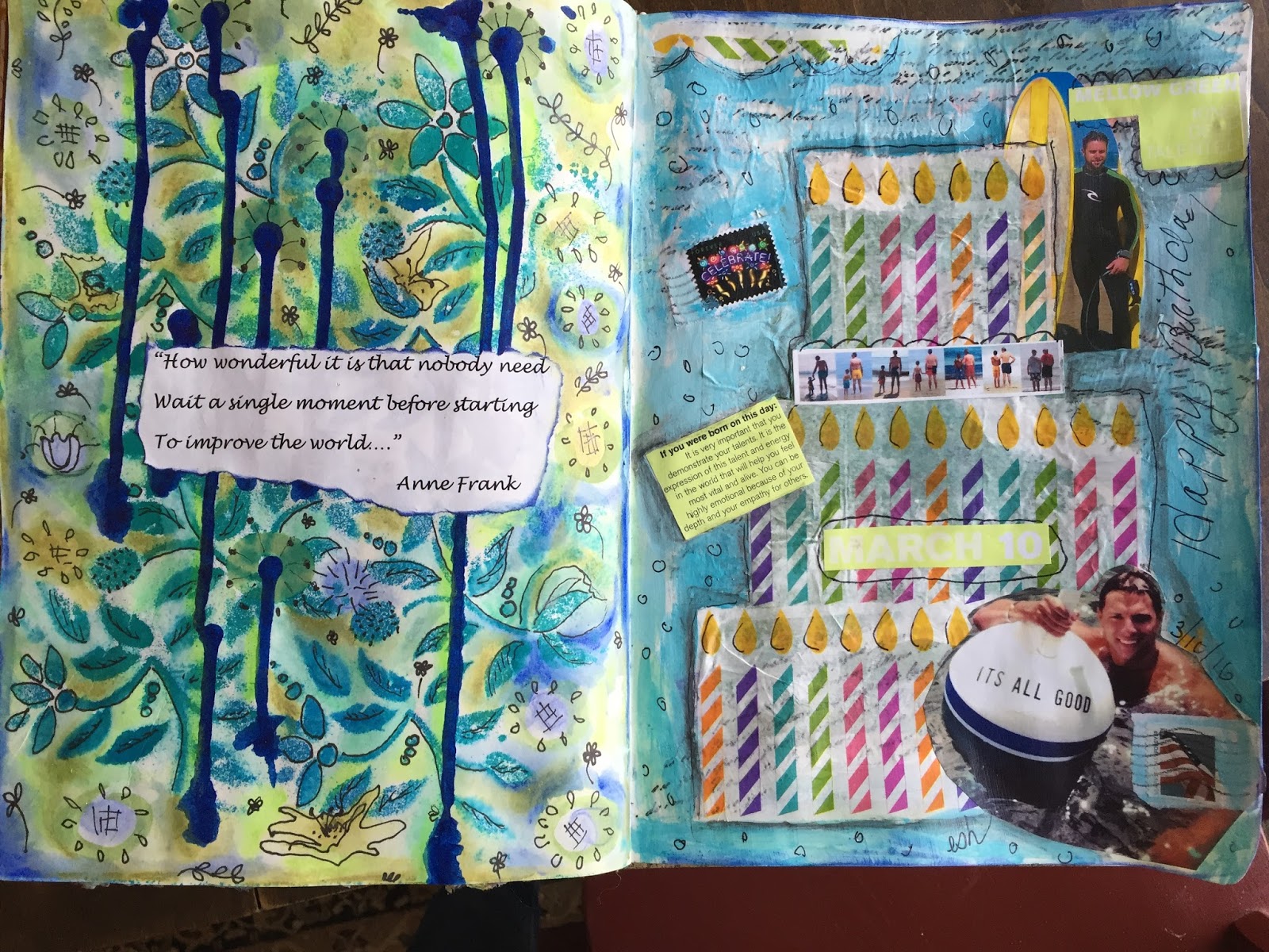
Pottery Barn Tri-fold Mailer
Creating a junk journal is really a great way to get your creativity going.  There are no rules here....it doesn't have to make sense and it certainly doesn't have to be perfect....We all get things in the mail like this.  The paper is heavy cardstock...
Open it looks like this...
The pieces across the bottom are already folded up, creating pockets and I stitched them on the seams on my sewing machine.  Now I've been inspired many times by Pottery Barn catalogs when I'm working in my journals.  I've cut out all sorts of things and glued them onto my pages.  Having this little mailer "journal" ready to alter...how great is that. ( I put gesso over the slick surface)
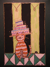
Here is what I did to the cover....


The top inch across is from the catalog....I did nothing to it.  The next part is the LOM (line over the masthead) from the local weekly newspaper where I live. "Don't stop thinking about tomorrow." - Christie McVie. (If you don't know who Fleetwood Mac is, what can I tell you). The next part is from a magazine, perhaps Architectural Digest...L'Art de Vivre....great title for my little book. 
Across the bottom, the building drawings are from the Sunday NY Times; an ad for a show called The Humans.  I know nothing about the show...love the drawings.  Let's go inside...
Flat View
Inside the tri-fold on the left is a postcard from an illustrator that I saved from work.  Love her drawing..."put on your thinking hat".  I actually have that attached with tape at the top of the fold.
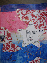
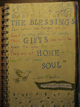
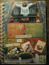
Underneath that card is what you see above.  The scallop at the top is a butterfly pillow in PB as is the colorful pillow underneath the words, and a bright yellow lemon.  The words are from an ad from Fidelity!  In the pocket I have a small envelope and the card inside says, Creative License...which is what I've taken with all of this stuff! Below is the middle spread.  I saved the window from the original ad as well as the pots, but I added another pot from the catalog.  The bird I had.  I found the words, room with a view, and wonder what the bird is looking at...note the book titles, Modern Views and Passage...kind of like how that works.  I also added a butterfly and the blue paper you see behind the pot is from a bank envelope.  
I made an ATC tag for the pocket that I painted blue, stamped a window design and added this cool female from CN Traveler magazine.  What is her view of the world you might wonder?  On the pocket I have a ticket for the San Francisco Railway that says ONE RIDE ONLY and I wrote the word Life on the sticker.  Self-explanatory there.

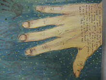
The right side of the tri-fold included a baby photo which I painted over, added the butterfly scallop at the top and left some of the baby blanket showing.  It says Start your story...isn't that where we all begin?  I added a tag that has a child's handprint and I wrote on it...We all have to grow up. On the pocket, I painted over the furniture photo, added an American flag ( I do that a lot in my work) and the sequin heart I glued to the hand.  Here's what the baby photo looked like...I also saved the Cuddle More, Work Less...you have to love that!  Out of the mouths of babes as they say....

Moving on....

The right hand page here (when it's folded) is kind of crazy.  It has the buildings on the bottom and a photo of silverware that I glued over words, again from the PB catalog.  I wrote the word SHINE across it. 
Flat view
With 6 individual surfaces and pockets, there was a lot to do here.  It kind of surprised me.  So...the middle here shows a chandelier from the PB, the graph from my electric bill, the word Bedazzled, a stamped candelabra and at the bottom, The Arts, The New York Times...here's a close up.


For a small journal, this is a long post. It was a lot of fun.  There are a couple of places I could still alter, but I think I'm done with this.  Go check your mailbox!